Using Responsive Design to Improve Customer Experience
Using Responsive Design to Improve Customer Experience
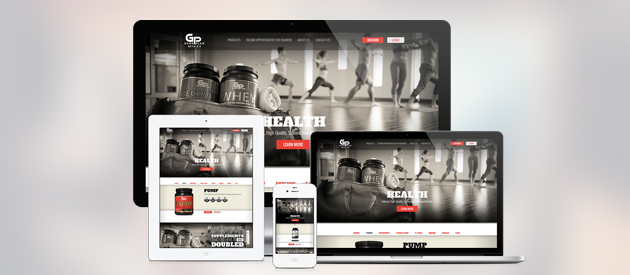
Simplifying responsive design for easier implementation
Responsive design isn’t complicated, yet it tends to intimidate many marketers. At its core, responsive design is about delivering superior consumer experiences by offering the same content across all devices. Whether in the form of blog entries, marketing emails or social media campaigns, your marketing messages have greater impact when delivered the same way every time.
Repetition a Key Factor in Reaching an Audience
The University of Kansas’ Community Toolbox points out several factors that make marketing messages effective. Among them is repetition. Not only must your message grab attention and convey the benefits of your product or service, but it must also do it many times. And the more often the audience receives that message via different channels, the “stickier” the message becomes.
An Increasingly Mobile Audience
According to Pew Research, Americans overwhelmingly believe the internet is a positive force in their lives and 39 percent said it is absolutely essential. The research shows that 87 percent of American adults use the internet and 68 percent access the web using mobile devices. Smartphone use has grown from 35 percent in 2011 to 58 percent over the past three years.
Research conducted worldwide by Accenture shows that in 2012, 58 percent of those surveyed owned smartphones, up from 26 percent in 2009. Tablet ownership grew from 8 percent in 2010 to 25 percent in 2012. For PCs, figures were more stable, growing from 91 percent in 2009 to 94 percent in 2012.
These figures show that mobile web use, on both smart phones and tablets, is growing and those who own these devices aren’t giving up their PCs. So, if you want your message to be received and accepted, you need to convey it across multiple platforms.
Picking Just One Platform Doesn’t Cut It
Many marketers simply choose to format all messages for mobile. Unfortunately, this tactic doesn’t achieve the desired result. Users expect richer content on their PCs and the limited content choices available to the mobile web hampers your ability to influence the overwhelmingly large percentage of users who access the web via PC.
If you want effective responsive design, it is simplest and most practical to use media queries. Media query code detects the type of device viewing the site and presents the most user-friendly layout to the user. Unfortunately, because most websites that have been around for a year or too are much too complex for mobile adaptation, that usually means scrapping your desktop design and starting over.
Let efelle help you implement responsive design for your website.
Efelle’s web design experts have the experience and skills to create a responsive web design that presents your message in user-friendly format across all devices. Call us at 206.384.4909, or use our online contact form to request a free consultation today.