Designing Effective Newsletter Pop Ups for Your eCommerce Website

Inspire More Sign Ups for Your Online Store’s Newsletter Via Attractive Pop Ups (That Don’t Annoy Your Visitors)
Newsletters are an effective way to remind both loyal and potential customers to come back to your store and check out the latest in what you have to offer. But getting users to sign up for your newsletter in the first place isn’t always as simple as putting a sign-up field in your website’s footer.
Designing and implementing attractive and well-timed mailing list pop ups can help remind site visitors that you send out regular updates and encourage them to join in on the fun.
With that in mind, here are a few tips for making sure you’re hitting the right note with a newsletter pop-up window (without making visitors want to bounce from your site as soon as it appears).
Nail the Visuals and Messaging
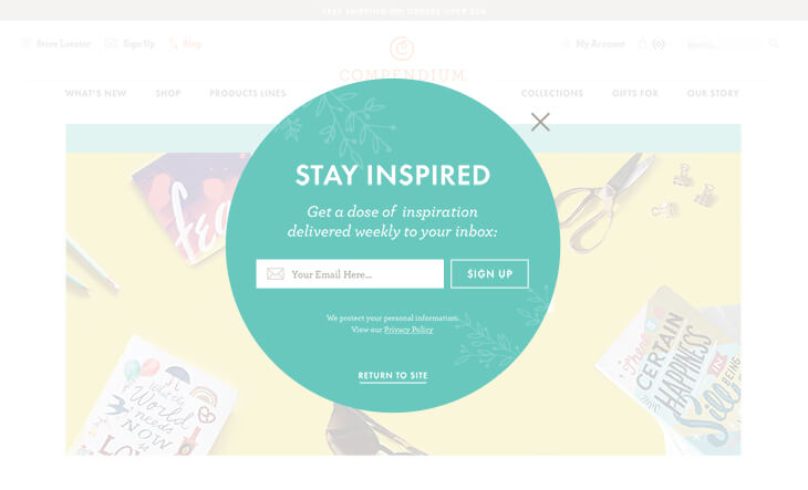
At the very least, any pop up that appears on your website should be branded, blending into the rest of the content on your site so it doesn’t come off as intrusive. At best, it should come complete with visual hierarchy and stunning visuals—all of which serve to guide the user’s eye to the form.
It’s also a good idea to feature an attention-grabbing headline (that’s bigger than any other copy elements in the window) to immediately capture the user’s attention. This can be followed by a brief description of how the user benefits from signing up for your newsletter (more on this below), written in a friendly and light-hearted manner (or whatever style works best for your target demographic).

Lastly, provide the user with a bold and prominent call to action once they’ve entered their email address; for example, instead of having the submit button simply say “Submit,” you may instead consider a catchier option that suits your brand voice, or choose to style the button in a bright, high-contrast color. (Do NOT feature more than one call to action in your pop up—this will likely only confuse users.)
In short, a good pop up both blends in and stands out. Sure there’s an art to making this happen, but it can be done (and we can help).
Let Your Customers Know Right Away “What’s in it for Them”
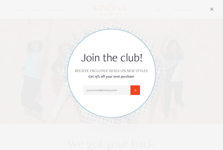
Individuals who sign up for newsletters are often doing so out of the hopes they’ll receive discount codes and promotion announcements. (In fact, according to WordStream, “60% of users sign up for an email newsletter to receive offers and sales.”)
If deals are something you offer to subscribers, make sure you include that messaging in your pop up. You may even consider making offers “only available for a limited time” to help create a sense of FOMO (aka, “Fear of Missing Out”).

Even if you don’t plan on sending out a bunch of promo codes, to inspire sign ups you should offer something, whether that’s a perk for signing up (like a one-time offer or a free downloadable report related to your industry), promises of new product arrival announcements, exclusive subscriber contests and content, etc. At the end of the day, most users are going to be asking “What’s in it for me?” And it’s important you answer that question for them before they click away from your site.
For more ideas on how to encourage eCommerce newsletter sign ups, check out this article or read my teammate Tessa’s recent post on “Easy Ways to Grow Your Email List.”
Make the Pop Up User Friendly—And Offer Users a Way Out
According to newsletter app company Sumo, less than 2 percent of site visitors sign up for newsletters. This means that as a marketer, you need to care about the remaining 98 percent.
There are a number of ways to make the pop-up experience more enjoyable for ALL users. First and foremost, make sure your form actually works. Test, test, test before adding any form elements to your live site.
Second, don’t ask your users for too much information—grab the user’s email address and maybe their first and last names. But beyond that, keep your request for info on the short end. If you want to send your users something special on their birthdays (like a discount code), you can feature a birthday field as well (just make sure your system is set up to actually follow through on this). But asking for more personal details like phone number, mailing address, etc. is one of the easiest ways to send your users running for the hills (and off your site).
Lastly, and perhaps most importantly, make it easy for users to navigate away from the pop up. No element is worth sacrificing user experience for, and anything that may potentially frustrate your users will do just that. As Veronica noted last week in her post on eCommerce homepage optimization, first impressions are everything. Pop ups that are hard to “X” out of might give potential customers the impression that your company lacks attention to detail or cares more about email sign ups than actual customer enjoyment. They may get so frustrated, they leave before browsing any of your products.

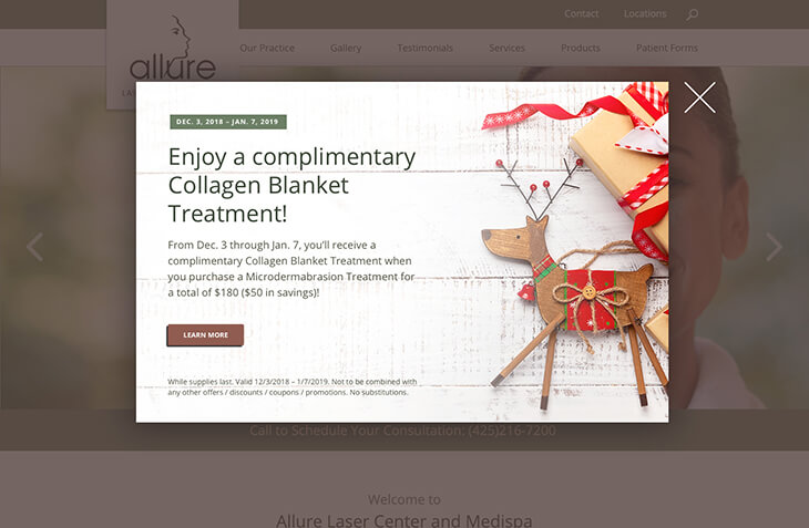
To this end, make sure your pop up comes equipped with a big and very-easy-to-select “X” that immediately closes the window. Better yet, allow users to navigate away from the pop up by clicking outside of the pop-up window (many users are used to this functionality and will not appreciate the fact that they have to carefully tap a small, predefined area to get where they want to go).
As a side note, since we’re on the subject of offering users a way out, it may also be a good idea to concisely communicate how many emails users can expect from you if they do sign up and how easy it is for them to unsubscribe from your newsletter. (For example, “We only send one or two emails a month and make it super easy to opt back out!”) You may inspire more sign ups if your visitors know you won’t flood their inboxes with email blasts that they can’t seem to escape from (we’ve all been there with newsletter subscriptions, right?).
Be Intentional with the Timing and Type of Your Pop Up
Not all pop ups actually need to “pop up.” There are all kinds of different styles when it comes to newsletter pop-up displays: full-screen welcome mats, top and/or bottom banners, overlay modal windows, non-intrusive slide-in boxes, and more. Consider your customer personas (we talked about these last week!) and think about which pop-up still will be best suited to your target audience.
Additionally, timing is everything when it comes to pop ups. Avoid triggering your pop up for right when users land on your homepage—at this time, there’s probably already a lot of other things happening on your site, including auto-generated requests related to location, site notifications, and cookies (you can thank the GDPR for that one).
Here are some alternative options:
- Set the pop up to appear after a certain number of seconds has elapsed once a user has landed on your homepage.
- Set the pop up to appear once the user has scrolled to a certain spot on your homepage.
- Set the pop up to appear on each users’ second or third viewing of your website.
- Set the pop up to appear when the user is exiting your site.
Make Sure Your Pop Up is Optimized For Mobile
As with all things on your website, it’s not good enough for each element to look attractive on large monitors alone. You need to make sure that your pop up looks as good and is as easy to use (and close) on mobile devices as it is on any other device. (Fun fact: At efelle, we’re all about mobile responsivity and recently shared some cool sites that do mobile well.)
Newsletters, Inbound Marketing, CRO—Oh My! We’re Experts in All Things eCommerce
Have your eCommerce sales fallen flat and you have no idea how to give them a boost? Let us know! We’ve been in the biz of helping online retailers increase conversions and inspire customer loyalty since 2005. If you’re ready to chat eCom, feel free to call us up at 206.384.4909 or reach out via our online contact form. We could talk about this stuff All. Day. Long.