A Primer on Mobile Responsive Website Design for Business
Why Responsive Website Design is the Best Option For Your Business
Responsive website design first appeared in mid-2009, with only the most experimental designers and developers dare attempting to utilize the new approach in website design and development, which uses "media queries" to figure out what resolution of device a site is being served on and then adjusts its display, accordingly. Practically speaking, this involves three main principles that come together to form the whole that is responsive design. They are:
- Fluid Grids
- Fluid Images
- Media Queries
Responsive design became widely accepted and mainstream in 2013, with media outlets calling 2013 the ‘Age of Responsive’, mainly due to tablets outselling PCs for the first time –which demanded a different but equal user-experience from websites.
Aside from the enhanced user experience, search engines also favor websites that are mobile-friendly, which was made clear on April 21, 2015, when Google announced that it would be including mobile-friendliness as a significant ranking signal.
What is responsive web design?
Responsive web design is an approach to web design aimed at crafting sites to provide an optimal viewing and interaction experience.
This includes easy reading and navigation with a minimum of resizing, panning, and scrolling), across a wide range of devices, from desktop computer monitors to mobile phones.
Today, it’s fair to suggest that a responsive strategy is expected from digital agencies; research has shown that:
- 80% of search traffic originates on a mobile device
- 69% of tablet users shopped on their device within the last 30 days, and search engines
- 60 Percent of Online Traffic Now Comes From Mobile
A ‘Mobile First’ Approach
Even before the start of the responsive design revolution, the idea of using a mobile-first approach started to take hold, which is the idea of designing the smartphone experience first and then working upwards to tablets, desktops. Mobile browsers represent a rapidly growing demographic that is on pace to eclipse desktop browsing, so designing a responsive site with a mobile-first approach is a natural evolution.
What Does Responsive Design Mean for Your Content Strategy?
A responsive website—one site, one content base, and one code-base—can adapt to new screen sizes or devices as new products come online.
It’s important to note that, contrary to the typical execution of responsive web design, a truly responsive design approach does not involve putting all of your content in front of the reader. Responsive design is about putting the right content in users’ hands according to the context of their interaction. This requires a content strategy that guides how you will deliver only what is absolutely necessary (whether it’s content or functions) at the appropriate points in the user’s journey based on the device. This isn’t just a technology change; it’s also a change in the way you plan and design experiences. It flips the paradigm of traditional web design on its head: instead of building a web framework and fitting content to it, content comes first.
What does Responsive Web Design Look Like?
An example of this can be found on www.seattlewebdesign.com –if you were to open this site in a full-screen browser and then reduce the width of your browser to a tablet- and then a mobile-viewport size you’ll see some well-thought-out changes in the delivery of content:
- The menu is condensed into an icon
- The masthead becomes a single image
- The call to action moves directly below the masthead
- The service listings drop their summaries
- Instead of 6 blog posts, there are 3
- Instead of 30+ portfolio sites only a handful show
Most responsive websites don’t take this approach, offering instead just a re-shuffled delivery of all or most of the content that is visible on the non-responsive site.

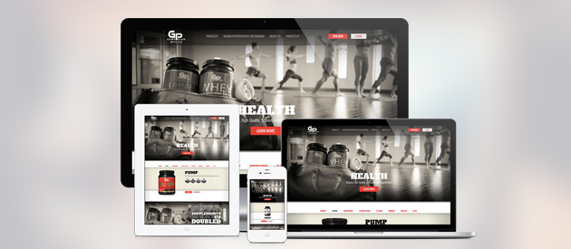
An example of responsive design from mediaqueri.es website
Three Tips for Adopting Responsive Design
Creating a responsive website is a discipline, both in your content strategy and in how you deploy your content. This should involve input from your entire website team, from the visual designer to your UX expert to the developer(s). Ultimately, responsive design is driven by the imperative of creating a better experience for your website visitors, so as your team prepares to build and execute the new site here’s a few tips to remember:
- Plan & Get Buy-In
RWD is different from the way people are accustomed to approaching digital projects. It’s important to plan it at the beginning of the process, not just at implementation. By outlining the effort in advance, you’ll more easily open doors to operational buy-in.
- Communicate
Your team must communicate through the entire process. Responsive design deployments are a large undertaking and it’s critical to have the design and development teams discuss how the back end will behave as the viewport is manipulated -for example, what happens when you have media queries for larger viewports or multi-column views? At efelle, we would up building our own framework that utilizes client-side tools, such as Ajax, to inject content depending on the viewports required.
- Work in An Agile Environment
The best results are experienced when you are able to prototype and test. Agile includes everyone on your team. For example, at efelle our responsive design team includes content strategists, visual designers, UX designers, and front-end developers who work collaboratively throughout the design process.
Responsive design introduces complexity and will, therefore, take longer than non-responsive design, but with a content-centric approach, proper planning, and the ability to test and measure, a responsive approach can help brands significantly reduce their costs and future-proof their digital investments…all while improving their user-experience and optimizing their website conversions.
More Responsive Resources
If you’d like to test a few pages, you can use the Google Mobile-Friendly Test.
If you're looking to redesign your website to make sure that it's mobile responsive - we can help. Our team of Visual Designers work to create optimal designs that are beautiful through both mobile and desktop design. To learn more about how it could help your business to have a responsive site, fill out our contact form or email us at [email protected]