Talk Like an efellian: Glossary of Common Web Terms

Looking to Add to Your Web Design and Development Vocabulary? Here Are Some Terms We Use on the Daily!
Each industry has its own shorthand and web design and development is no different. If it sometimes sounds like our team is speaking another language, here’s a little glossary breaking down some of the words and phrases we get asked about all the time.
General
CMS
Your website’s content management system, or CMS, is where you go to store and update the content on the front end of your website. A good CMS makes it easy for you to upload, type in, and style all content on your site, with every option only a few clicks away. (see also: “Front-End Web Development, WYSIWYG.”)
At efelle, we build and maintain our own proprietary CMS, FusionCMS, based on client feedback. It’s fully customizable for every project—and we can even build out additional CMS application features by special request. (And not to brag or anything, but it’s also fast and super secure.) Wanna learn more? Just ask!
Conversion
When our team first sits down with new clients, we ask them what their objectives are for their new website. Common responses include getting users to buy a product or reach out to the client’s team.
Later, when a user visits their site and completes one of these desired actions, we call it a conversion. Most web analytics tools—including Google Analytics—allow you to define and track conversions for your website.
Cookie
Cookies refer to a small amount of temporarily stored data sent to your computer from a website. Websites often access this temporary data to improve user experience. Cookies are responsible for remembering things like the products you placed in your online shopping cart or the content you typed in a form so that it appears again if you accidentally close your browser or leave that page. For information about cookies and privacy, check out our recent post on GDPR.
Cache
Cache refers to temporary data stored on your computer or mobile device. Applications—like your web browser—will often store, or ‘cache,’ data so that the next time you visit a website, its pages load faster. While most cache will clear over time by itself, if you make changes to your website and you don’t see them show up right away, it make be a caching issue. Check out this link for more information on how to manually clear your cache in any browser.
Homepage
You can think of your homepage as the headquarters for your online branding. It’s typically accessible from your primary domain (ex: https://www.seattlewebdesign.com/) and leads visitors to other key areas of your website. A homepage usually determines a site visitor’s first impression of your business, so it should also offer a brief but descriptive intro into what you do.
Landing Page
Landing pages, on the other hand, are typically created to drive visitors to complete one primary action. They are sometimes referred to as Lead Generating (or LeadGen) pages.
Tracking scripts can be set up on landing pages to gauge conversion success rates and help you determine if there are better ways to drive traffic and encourage the behavior you’re looking for.
PPC
Looking to get a little extra traffic to your site? Pay-per-click (PPC) marketing is one way to do this.
PPC marketing campaigns allow you the ability to feature your website above organic (non-paid) search results for particular words or phrases that people input to search engines. Highly competitive search terms are more “expensive” than others, meaning that you pay more every time someone clicks on your ad after searching for those keywords.
Overall, PPC campaigns can be an excellent way to get exposure for your business, especially if you’ve just launched a brand new website. And, of course, we work with some of the best PPC campaign managers in the industry! Give us a shout if you’re interested in learning more about any of our ongoing PPC management services.
SEO and Keywords
Search Engine Optimization, commonly referred to as SEO, helps determine how people find your website in major search engine like Google and Bing. If your SEO game is strong, your site is more likely to appear closer to the first few results for the keywords relevant to what you do.
One of the most common questions we get is this: how do you rank first on Google? Well, we can’t exactly boil it down to a simple formula. There are a variety of things you can do to improve SEO: optimize your images and videos to reduce load speed, make your website mobile responsive, use headings appropriately, etc. When it comes to organic results, your success in search engines is directly related to the quality and relevance of your page content.
Need help upping your SEO game? Ask us what we can do.
SSL Certificates
SSL stands for Secure Sockets Layer. In short, an SSL certificate creates an encrypted connection for users when they visit your site and is vital for the security of those users. It’s especially critical for generating user trust when they provide sensitive information to set up accounts or make purchases online.
Good news: At efelle, we’re more than happy to install SSL certificates for all of our clients. Browsers may prevent users from directly accessing websites that do not have an SSL certificate installed, and not only is it important that we protect your site visitors’ data, it’s important to us that all users are able to access your awesome new website once it’s live.
Content and Design
Aspect Ratio
To borrow the definition from Dictionary.com, aspect ratio refers to “the ratio of the width of an image to its height.”
So, why does this matter?
Knowing the aspect ratio of the space you’re trying to update helps you resize an image to those dimensions to avoid distortion and/or cropped out portions of the image once it’s uploaded.
This is particularly critical for masthead images (see, “Masthead). Because masthead images tend to have an aggressively landscape (versus portrait) orientation, not all images and photos work in these spaces. We get a lot of images selected for these spaces that are too “zoomed in” to a person’s face or a product label. Selecting images that are more wide than they are tall is almost always a better option.


If you’re looking for the aspect ratio of an image used on your site, you can download the image to your computer; then, right-click on the image file to view “Get Info” on Mac or “Properties” on PC. The dimensions will show the pixel height and width of your photo.
You can then plop those dimensions into an aspect ratio calculator. You can also use online image resizing tools to crop to dimensions reflecting specific aspect ratios.
File Size
Unlike the aspect ratio, which measures only the dimensions of an image, file size measures the total size of a file stored on your computer or your website. File size determines the amount of bytes that your computer is required to process in order to download the image. The features of an image that contribute to its total file size include format capabilities, content of encoded data, image quality, pixel dimensions, and more. The larger the file size, the more bytes have to be downloaded in order to render the content on a screen.
As a result, optimizing your images (significantly reducing the size of an image) typically results in performance improvements for your website—the fewer bytes on a web page, the faster a browser can download and render content on the screen. You can use online image compression tools like TinyJPG.com to easily reduce the file size without sacrificing image quality.
CTA
CTA stands for “call to action” and refers to elements in a design that encourage users to perform a specific task, like complete a form or purchase a product. For an example, if you have a button in one section of your eCommerce site that reads, “Shop Now,” we call that a CTA button.


Headers & Footers
Site headers are blocks of content at the very top of a site, and often contain the company logo, site navigation menus, and maybe a primary call to action like “Schedule an Appointment.” (see also, “Main Menu/Navigation”)
When the header “follows” you as you scroll down a page, we call that behavior “sticky.” You might hear us drop the terms “sticky header,” or “sticky nav.”
Footers function very similarly, though they’ll also house links to lesser-used but necessary areas of a website, like the copyright statement, privacy policy, and sitemap. Contact information, hours of operation, and links to social media accounts are also great elements to house in your website’s footer.
Headings
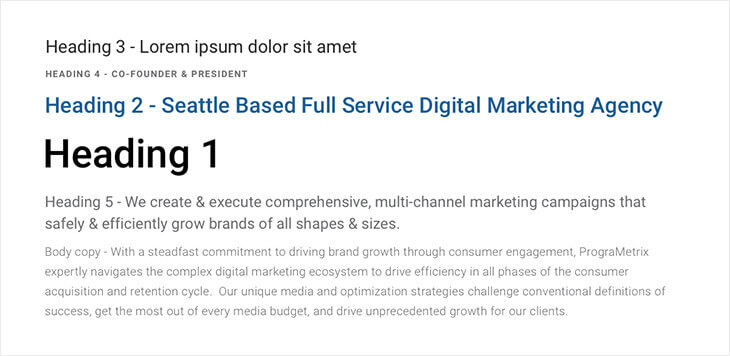
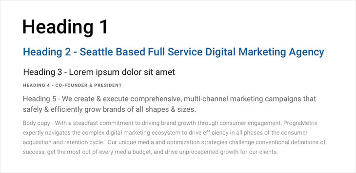
Headings provide architecture for the textual content on a page. Using headings well helps boost SEO. Most sites have up to six headings (h1, h2, h3, etc.) that can be programmatically styled so that when you’re working in your CMS, all you have to do is designate a line of text as the desired heading and voila—it’ll appear styled in a consistent manner with all other blocks of text that heading has been applied to. (see also, “CSS”)
You can think of headers as the section titles of a textbook. Your h1 is your chapter heading. An h2 is a subtitle introducing the first area of content within that chapter. An h3 introduces a sublevel of content related to the parent h2, and so on. As a best practice, only ever feature a single h1 on any given page. You can use more than one h2, but make sure you’re not using lower level headings above the h2’s in any given section.
Don’t do this:

Do this:

Lightbox
A Lightbox is a feature often used for galleries that uses a JavaScript (a web coding language) library to display images and videos in a “pop-up” upon click. The Lightbox script has been widely used in web design since its first release in 2010 and typically allows users to toggle through various images featured in the same Lightbox gallery.
Main Menu & Navigation
We’ll use the terms Main Menu, Main Navigation, and Main Nav interchangeably. This simply refers to the collection of links that visitors will use as their primary way of clicking through your site.
Sometimes the main nav will feature category items listed horizontally at the top of the page (in the header), using “drop-down menus” under each item for users to access sublevel content pages.
Other pages use a “hamburger” menu (typically indicated by three lines vertically stacked in the top right- or left-hand corner of the page) to keep navigation content collapsed but easily accessible with a single click. With the introduction of the smartphone, saving screen real estate became a big priority for most websites; flyout menus like these became popular options for mobile responsive website designs. (see also, “Responsive”)
Typical header layout for main navigation:

Hamburger navigation with flyout menu:

Masthead
The masthead area is the section on any homepage or subpage that sits just below the header. It typically features a large, full-width image or video and large text. This full-width image is sometimes referred to as the “Hero Image.”
WYSIWYG
WYSIWYG stands for “what you see is what you get” and refers to a large text editor where you can add and edit content for a given page or post in your CMS. Most content management systems will feature WYSIWYG blocks with styling and layout buttons like those commonly found in word processors like Microsoft Word. A WYSIWYG allows you to set headings, add images, adjust alignment, and more.
A WYSIWYG prevents you from having to enter and format the content of your website in an HTML file.

While some text appearance, like fonts, may look slightly different in the WYSIWYG than on the public-facing end of your site, a good WYSIWYG creates enough visual separation between various elements to indicate where style and alignment features have been applied.
Development
301 Redirects
When you redesign your website, the URL structures for different pages often change. 301 redirects allow you to specify where you want your old pages to direct to once they no longer exist.
This is important for avoiding 404 errors—which you’ve likely run into when trying to view a page on a website that cannot be found. The last thing you want is for users to land on an error page when they click a link to your website from another website, a previous social media post, or email marketing campaign. When your website launches, we help build 301 redirects to prevent new users from leaving your site and to maintain visitor trust in your brand.
CSS
CSS stands for “Cascading Style Sheets.” It’s a front-end web development language that interacts with the HTML on a given page to add stylistic flair to specific elements and to help make sure elements of the same type render consistently across the entire site. (see also, “Front-End Web Development and Applications Development”)
Front-End Web Development and Application Development
What the public sees when they navigate to your website is what we refer to as the “front end.” Front-end development refers to the process of creating fully functioning websites using design “mockups,” that are typically provided by a web designer. The most common web languages a front-end developer uses are HTML, CSS, and JavaScript, though others may be required from time to time. (see also, “HTML”)
Application developers focus on building the web systems that are required in order for the front-end development to function as intended, improve website performance, and provide tools for front end developers to improve the process of building a website. At efelle, the primary focus of our application development team is the improvement and advancement of our proprietary content management system, FusionCMS. All the features you see when you log in to your website’s CMS were created by the application development team.
HTML
HTML, or Hypertext Markup Language, is the foundational language for front-end web development. It works in tandem with CSS and JavaScript to achieve the design and functionality specifications of your website. You can think of HTML as the architecture of most websites while CSS is the interior design.
QA
QA is shorthand for Quality Assurance Testing. This is one of the most critical phases of the website development process, especially when building custom-designed websites as we do here at efelle.
At efelle, we conduct multiple types of QA. As a best practice, we attempt to do iterative QA throughout the build—in other words, rather than saving all testing for the very end, we try to test elements as they’re built out so that we can address potential bugs before they become an issue for the whole site.
Officially, however, our testing process starts with Design QA. Here, the project’s designer compares the front end of the website to the design, sending notes to the developer for adjusting elements to better reflect the original vision for the site. This process allows us to guarantee that the finished product will reflect the approved design as closely as possible from a programmatic standpoint.
Functionality QA comes next. This involves our team going through the whole site from top to bottom, clicking all the links, testing the form, making sure there are no broken images, etc. We also encourage our clients to take part in their own functionality QA process as they may anticipate page use and navigation differently than we do.
Cross-browser QA is a subset of functionality QA. Here we make sure to test every area of the site on all major browsers, accounting for different screen sizes and making sure all scroll animations, hover effects, etc. are functioning as planned.
Responsive
Mobile-responsive websites are those that “respond” to a site visitor’s browser size, screen resolution, or viewing device to create an optimal viewing experience on mobile platforms and desktops alike.
Unlike on a mobile-specific website—which uses a completely separate set of page designs and content, is housed at a different URL, and is built specifically for phones and tablets—the content of a responsive website is always available on every device and is managed all in one place.
We Walk the Walk and Talk the Talk when It Comes to Web Design and Development
Looking for a new website to take your online marketing game to the next level? efelle creative has been making the internet beautiful since 2005. Hit us up using our online contact form or give us a call at 206.384.4909 so we can start chatting about the next steps you should be taking to achieve online marketing greatness.