5 Web Design Trends We're Loving Right Now
Elevate Your Online Presence with These Next Level Design Trends
Feeling stumped on design inspiration? Looking to add a little je ne sais quoi to your company website? Here are five trends we’re loving in design right now.
The Fullscreen Homepage
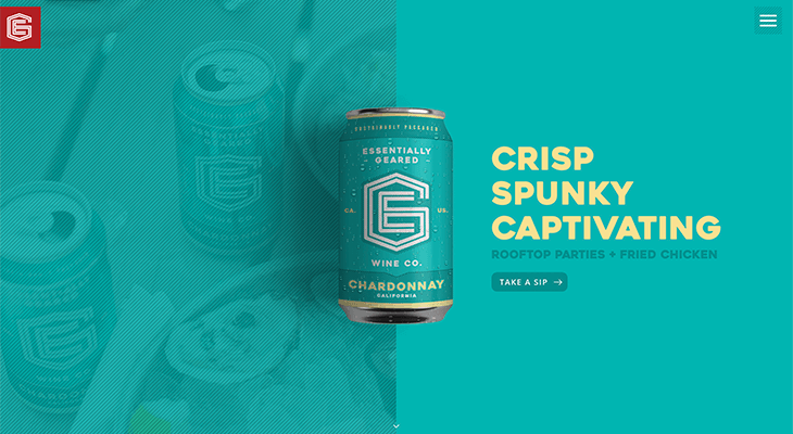
Do you dream of sharing your company’s story on a giant billboard? A fullscreen homepage is the web version of just that. Flooding the entire width and height of the browser window, this layout allows large text and imagery to pop! Users scroll from panel to panel to explore the products and services on offer, with each panel operating as its own dedicated space to highlight a specific item or concept.
There are a number of advantages to this approach, the most obvious being that users are treated to an immediate “wow” factor when they land on the page. This style of layout also helps focus the user’s eye on key concepts, and given that we live in an age of shrinking attention spans, it’s more important than ever to minimize distractions.
Successful fullscreen layouts often involve large, hi-res imagery or videos, vibrant color, and condensed, keyword-rich messaging—saving more expansive content for the interior pages and/or attached files. Head over to Essentially Geared Wine to see what we’re talking about.
Using Movement to Enhance Brand Voice
Website design is about more than just images, text, and layout—it’s also about how things move. Intentionally designing how different elements of the page appear on scroll or hover can add personality to the page and emphasize brand voice. Smooth, beautiful animation of different elements not only catches the eye, it says a lot about your company.
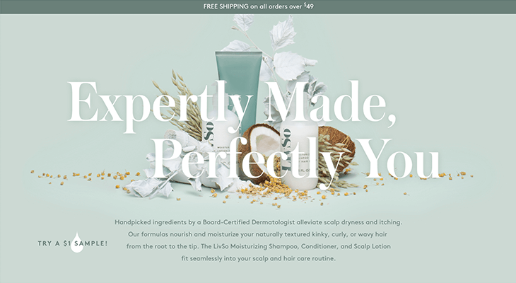
Think of scroll and hover animations as a dance—an emotion-evoking interaction between your site and the user. What style of dance best reflects your brand? If elegance is the end game, consider channeling a ballet vibe and incorporating graceful, slower movements across your site. For example, subtle, fluid element animations and cool tones on the LivSo website together create a feeling of relaxed beauty.
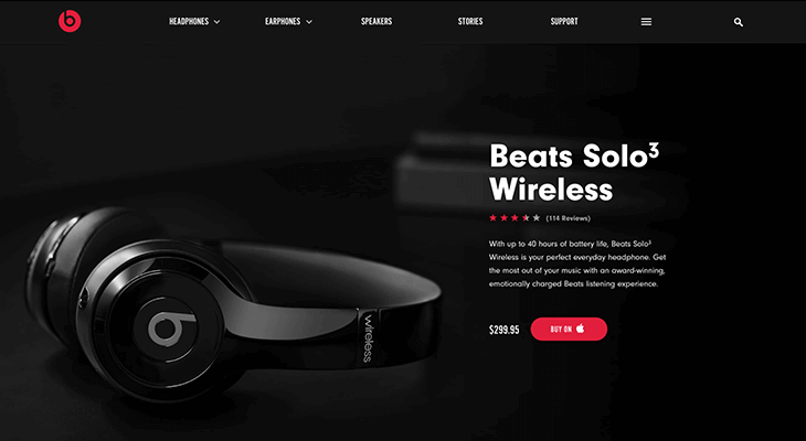
On the other hand, if you’re looking for something a little more high energy without sacrificing the rhythm—not unlike hip hop dance—think of using elements that pop in unexpectedly or that have a more rapid-fire feel to them as they build onto the page. Unsurprisingly, the specs section of the Beats by Dre product pages does an excellent job of this.
Atypical Navigation
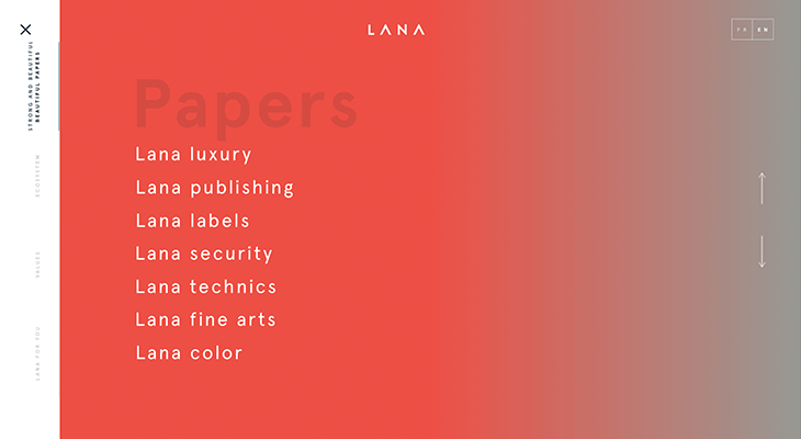
Don’t get us wrong, the basic top navigation bar is great for an intuitive user experience. But if you’re looking for a way to stand out from the crowd—and aren’t set on playing it safe—taking a creative approach to where your main nav is located and how it works can help shake up user expectations and grab their attention.
Lana Paper Mill offers a great example of a main nav menu that is interesting and enjoyable to explore; using a hamburger-style icon in the top left to indicate menu access, it aligns with user expectations in location but then delights the eye as it opens into a full-width, brightly colored menu.
Personal Illustrations and Animations
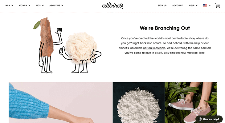
In a world of templates and stock photos, it’s refreshing to see hand-drawn elements on a webpage. This kind of touch can be used as arrows leading to a call-to-action button, as iconography, as image caption text, and more. Some sites add animation to these illustrations to bring out even more brand personality—Allbirds offers a quintessential example of this trend.
Tie it All Together with a Tight Narrative
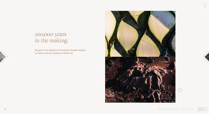
Humans are wired to be tribal—we crave connection with others and use our previous experiences to understand the people around us. One of the most effective things you can do to capture the attention of your audience is to present them with a concise narrative that flows seamlessly with the design elements around it. Rather than posting an essay to your “About” page to describe what makes your company tick, consider breaking it up into blurbs. Get heavy with emotive imagery and movement (yep—tying together pretty much all we mentioned above) and incorporate personal photos to show users who you are and what you do. Lastly, use everyday language whenever possible—avoiding jargon not only makes your message clearer to all users, search engines love it.
It’s all about establishing personal connection. When we feel like we know the people behind the business, we’re more inclined to support it (and maybe make a purchase or two). Check out Volcán for maximum inspiration—this site does a great job of taking the user on a journey through their history, inspiration, and process.
Looking for a Professional Website Redesign? Our Designers Are on Top of the Game
Keeping up with the digital Joneses is a tricky business. Here at efelle, we not only stay on top of what’s current, we build our designs with SEO and conversion in mind. With over 100 design awards under our belt, we’ve got proof that we don’t just talk the talk—we walk the walk. What are you waiting for? Give us a call at 206.384.4909 or fill out our contact form. Let us show you how we can bring a whole new swagger to your online marketing game.